Tuesday, July 22, 2025

Rainbow Mosaic Path

My third project with the May Betterpress Society plate, Mosaic Path was done with a rainbow ombre background.


I used five Pinkfresh Studio inks: Blue Jay, Aquamarine, Sunshine, Sparkling Rose and Candy Violet, inking directly onto the plate, following the design.  Since I didn't want any sharp edges, I used my blending brushes to smooth out and blend the ink.

I huffed on the panel before pressing, as it takes a minute to get all five colours inked and blended - but it pressed beautifully onto a Porcelain Cotton Card Panel.

I had a bunch of "Floral Spray" die cuts already in my stash - and they just happened to work really well with my panel, so I created a little grouping on one side of my background.

I added "Best Wishes" in metallic gold cardstock, double stacked, to match the gold centers on the flowers.

You can get a Betterpress Society subscription from The Papercrafter's Workshop.


Sunday, July 20, 2025

Rainbow Pattern Play

Time for another couple of cards using the Pattern Play dies from Concord & 9th.  This was an idea that I got from Maggie Haas, who did a similar card with this set.


I die cut enough bits and pieces to get four of these made!  Once that was done, the assembly went pretty quickly.


The sentiments are from the Dashing Sentiments stamps and dies from Pigment Craft Co.

I think these would look equally stunning on a black background!  But it's summer... and I wanted some light and happy cards.

Saturday, July 19, 2025

Layered Mosaic Path

My second card with the May Betterpress Society plate, 'Mosaic Path' is a layered pressed card.  

I first pressed two of the leaves from the August BP Society set, Layered Leaf Prints in Apricot and Passion Fruit inks from Pinkfresh Studio, on regular white cardstock.  Then the May plate was pressed on top, using Lisa Horton Craft's metallic Copper Pot ink.

I pressed one of the sentiments from the set in Betterpress Black ink, and cut it out with the coordinating die.  I used the die to cut a halo shape from rosegold cardstock that I layered behind the sentiment.  The card was finished off with a bunch of irridescent pearls.


You can get a Betterpress Society subscription from The Papercrafter's Workshop.


Friday, July 18, 2025

Cruising Carol

I have another of the new Ai People stamp sets today - this is 6075 - Cruising Carol.


I stamped her on Cryogen Solar White paper with Memento Tuxedo Black ink, and coloured her with Copic markers

I pulled out some older Graphic 45 papers that matched her outfit, and added some flower dies from Art Impressions to finish her off.  Ai has created some wonderful coordinating papers that have ready-made backgrounds (so travel/cruise themed ones for Carol... golf scenes for the golfer I posted a few days ago, etc.).  Check them out on the Art Impressions website.


Thursday, July 17, 2025

Quilted Frames & a sketch

I am playing along with the July sketch offered in the Papercrafts Inner Circle group on Facebook.  The focal part of the sketch reminded me of a quilt block, so I pulled out my Quilted Frames dies from Waffle Flower and got die cutting.

This is an ancient paper pack from Basic Grey called Persimmon!  I thought it had a bit of a quilt vibe, so picked out a few papers that went well together and used the larger square to cut each of them out, then mixed and matched them to create my quilt look.

The sentiment is a Betterpress set: You Are Everything Sentiments from Spellbinders, pressed in metallic Copper Pot ink from Lisa Horton Crafts.

Be sure to check out the Facebook group when you get a chance.

Wednesday, July 16, 2025

New Ai People!

I have always love the Ai People that Bonnie creates for Art Impressions.  They are releasing five new ladies today - all with a little attitude!  I am from a golfing family, so was excited to see 6080 - in the line up!

I stamped her along with her golf bag in Memento Tuxedo Black ink on Cryogen paper, then coloured her up with Copic markers.  (I just happen to own a pink & black golf bag exactly like this...)  There are coordinating dies included in the set which I used to cut them out.

I created my background with three colours of cardstock, a Memory Box die that cut the golf skyline, and my Lawn Fawn hillside for the foreground.  I glued the golf bag to the background, then double layered the golfer to give her some stability, and popped her up with some 3D foam adhesive.  There are a bunch of sentiments in the set, so I picked "Still got it" and stamped it directly on the background with Versafine Onyx Black ink.


Sunday, July 13, 2025

Mosaic Path Press Plate

The May Betterpress Society plate is called "Mosaic Path".  It's a pretty all-over mosaic like pattern, that comes with two sentiments and dies, plus an optional stencil.


I decided to make a Stacked Die Cut Card, first pressing the plate in Betterpress Black ink on regular white cardstock.  I picked a blue/green palette of colours from my Pinkfresh Studio inks, and used three of the five stencils to create my pattern (I liked the white space that was left).

I created a frame by taping together two sizes of the Essential Arches dies from Spellbinders, cutting it out of my stencilled panel, and then cutting four more from black cardstock.  I stacked the black frames, and glued the patterned one on top.  After adhering the outer patterned panel to my card base, I added the stacked die cut frame, and then the center piece - creating a subtly raised frame in the middle of my card.

To finish, I pulled out the 'You' Say it With Stamps word die and phrases from Photoplay - and added the word die with foam adhesive to my card.  The 'are my favorite human' phrase is my favourite - and I thought it made a cute addition to the card.  A few black gems finished it off.  You can get a Betterpress Society subscription from The Crafter's Workshop.


Thursday, July 10, 2025

Owls

We have friends who have a granddaughter who is not quite two... that has a thing for owls!  How cute.  She mentioned that she had sent her an owl card in the mail, so I knew that I'd be diving into my craft supplies to find some images from Art Impressions that I'd stamped out years ago.  Anyone remember the Whoots?  I have two cards using the larger Whoot stamps (done in strong bright colours!), and I had one of the tiny Front & Back owls stamped out for my third card.


The Front & Backs work best with a cutout, and they're so small that you really need to create a scene around them.  I pulled out some dies to add a branch and a bunch of leaves in patterned paper.  Since it was showing through to the inside, I added a bunch there as well.


Such a fun project!

Tuesday, July 8, 2025

Classic Daisy Trio

More Daisies today!  This is the Daisy Trio press plate & stencil set by Yana Smakula for Spellbinders.

This was a more classic version, I used Pinkfresh Studio ink for the background - pretty decent coverage this time, but still a little distressed (which I'm okay with!).  I blended a soft blue onto the petals, and used a yellow/green combo on the centres.

I went up one shade darker in the aqua ink for the shadow stencil.  The sentiment is from the Spellbinders Serenade Sentiments, cut in their brushed silver Treasured cardstock - and layered once more.


Monday, July 7, 2025

Daisy Trio

I have waited a while to get my hands on the Daisy Trio bundle by Yana Smakula for Spellbinders.  It sold out quickly!  Thanks to Sheri at the Papercrafter's Workshop - who was able to special order it in for me.

This was my first press of the plate, using Speckled Egg Distress Oxide ink (it presses the entire background and daisy outline, leaving the daisies white), and it was hard to get complete coverage - although it's getting better the more times that I use it.  I ran it through my machine twice, and there was a slight movement of the plate, so the image is a little off - but after putting it aside for a bit, I decided to try out the stencils anyway, and am thrilled with the results!

I used Tattered Rose and Worn Lipstick on the petals, Antique Linen with a little Vintage Photo on the centres, and Bundled Sage on the stems.  At this point, I was starting to really love the slightly distressed look of the background, and the soft-focus of the image.


I added some splatters of white paint, and added the Beautiful die from Pinkfresh Studio in metallic gold, with a few gold pearls as accents.  Stay tuned... there are many more of these to come!

Sunday, July 6, 2025

Hiker Foundation and Water of Life


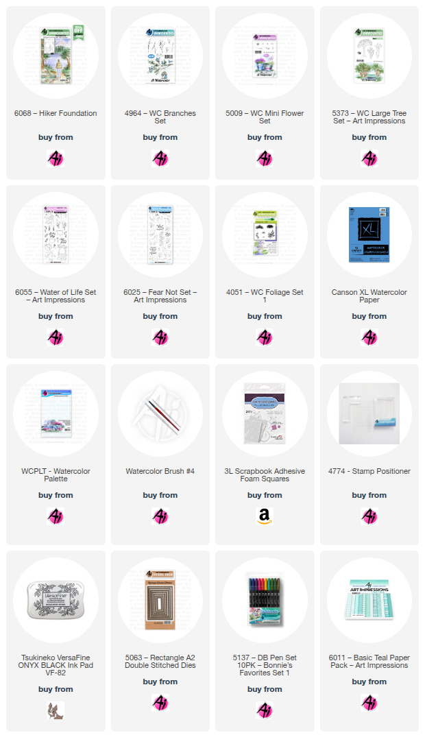
I am on the Art Impressions blog today for their Watercolour Weekend post!  My first card is using one of the newly released Scenic Foundation sets that have more of a masculine feel to them.  This is the 6068 - Hiker Foundation set.


Using my Misti, I stamped the image onto my Canson XL watercolour paper using Tombows #969/565.  *With a larger image like this, it helps to use a stamping platform, as you can reink and stamp it a second time if your first impression isn't perfect.  Before stamping the foliage, I painted light shades of #565 on the mountains, getting a little darker for the hills in the foreground.  I was aiming for some striking contrast, so used #346 to paint in the two closest bits of land.  I wanted a bit of a sunset sky, so I started by mixing #991 and #856 to give me tones of yellow and peach.  I echoed the same colours in the water, reflecting both the mountains and the sunset.  I added streaks of darker tones to the water to make it look like ripples on the lake.


The grass in the foreground was painted with a wash of #177, and layers of #992 were painted on the pathway.  The two main trees were painted with streaks of #992/969/947, as were the edges of the pathway under the grass overhang.  After pulling out the colour of the rocks with my damp brush, I added more shades of N52/565/992 to the stones, creating contrast between the rocks.  I used the foliage stamp from 5373 - WC LG Tree Set and #177/249 to stamp the foliage on each of the trees, turning the stamp so that it would appear irregular.  I touched the foliage with a damp brush to soften it, and added in a few darker tones for shadows.  I used the tiny sprig from 5009 - WC Mini Flower Set and #177/ to add a few low shrubs in and around the trees and rocks, then added a few branches from 4964 - WC Branches Set in #969.  A little grass was added in #177 using the small grass from Foliage Set - 4051.


I painted the hiker in coordinating colours #565/992/177/969, other than his bright hat in #856.  I hadn't painted in the sun before I added the foliage (should have!), so I just dabbed some white at the edge of the mountain, and then painted some white streaks into the water to indicate the sun.  White paint was also used to add in some flowers on the shrubs.  As a final touch, I used my paint brush and #346 to add a line of pine trees to one of the hillsides.  The image was die cut with the 5063 - A2 Rectangle Double Stitched Dies, matted with a warm brown, and adhered to my base with 3D foam adhesive.

My second card is using two of the new sets from the Bible Journaling line.


I die cut my Canson XL watercolour paper with the 5063 - A2 Rectangle Double Stitched Dies, and stamped the sleeping lamb from 6025 - Fear Not Set using #969/565.  After masking him, the stone well from 6055 - Water of Life Set was stamped behind him.  I pulled out the colour from the lines on the well, concentrating the colour where shadows would be - then added more N52/565 to darken the stones.  On the lamb, I added #850 to his ears and nose, and painted it as a wash over his fleece, to add a little warmth.  N52/565 were used for shadows, and to add some dabbled texture to indicate the fleece.


#126 was painted as a wash for the grass, and #493 done as a wash in the sky.  The two long grass stamps from 6025 were stamped around the well in #177, and two of the floral images were stamped in #177/856, on either side.  The small grass from Foliage Set - 4051 added a little texture in #177 around the bottom.  I used a light version of #565 to paint the bird, and touch some pale orange to his beak.  I used my black Twintone marker to darken the eye of the bird, and those of the lamb.  My grey Twintone marker was really helpful in redefining the lines of the well that had blurred a bit after painting, and for darkening the bird's legs.  Since I don't have a lot of luck in spattering paint on my images, I used the grey Twintone to add little dots around my image to suggest a little texture in my painting.


The sentiment is from the retired Exclusive Daisy set from several years ago.  I added a grey mat to my painting, and adhered it with 3D foam adhesive to my base which is paper from the 6011 - Basic Teal PP.
Friday, July 4, 2025

Yana's Daisies

My niece brought this die and embossing folder for me to try... and I had about 10 minutes to quickly die cut it in three different colours!  This is the gorgeous Yana's Daisies etched Die set.

I also got to try the Molded Frame 3D embossing folder, so I embossed it on some textured green cardstock, there is a mat die, that goes around the daisies, so I also cut that in green, and adhered the white daisy outline to it.  Since I cut the daisies in three colours, I mixed and matched each of them.  The sentiment is the It's Your Day Sentiment Strips press plate.


On the pink base, I added some green butterfly paper that was cut with the Hemstitched Rectangles die, and then the pink daisy outline was adhered to a vellum mat.  The Sentiment Strip was pressed onto Treasured Gold cardstock, and a few gold pearls finished it off.


I used the Etched Diagonal background plate from Pinkfresh Studio on my white card base, and attached the green daisy outline onto a white mat.  The sentiment is from the Every Day Sentiments press plate, pressed in gold ink.


All products are Spellbinders, unless indicated.

LinkWithin

Related Posts with Thumbnails