What a beautiful press plate this is from Hero Arts! This is the Lotus Field plate and coordinating stencils.

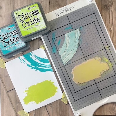
It is an all-over background plate, so you need a lot of ink coverage. I used Distress Oxide inks to do both a solid Peacock Feathers background, as well as a three colour ombre ink blend.

The coordinating stencils allow you to ink blend the petals as well, but there is also a detail layer. Quick and easy to complete an entire panel.

For the ombre background, I used Twisted Citron, Mowed Lawn and Peacock Feathers.

I did minimal colouring of the flowers on this one - just a little soft yellow behind the centers.

The sentiments were all done with gold foiling on Spellbinders black cardstock. You can find the set at The Papercrafter's Workshop.