Thursday, July 30, 2020

Another Retro Shops Card

Hello Ai Watercolour fans!
A few weeks ago, I posted a softer retro-feel look using 5260 - WC Large Shops Set, and I have another one to share with you today, using the other shop image.  *The Ai Design Team is participating in the Cards for Kindness initiative put on by Scrapbook.com - scroll down to see what I'm sending in!
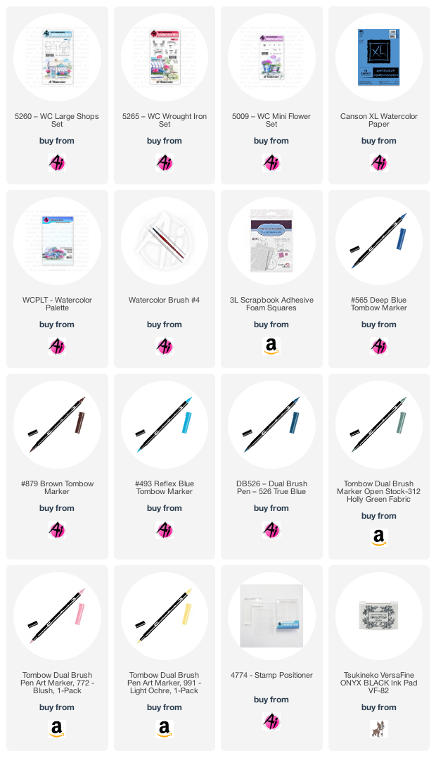
 I inked up the shop with my Tombow Dual Brush Marker in #879 Brown, and softened the lines with my damp #4 paintbrush - I love the smudgy/hazy feeling it gives to my scene!  I pulled out the brown colour to add a light wash to the roof, and painted in the door handle hardware with my brown.  Since I was aiming for a soft & pretty effect, I chose #772 Blush - coloured on the tiny dotted flower image from 5009 - WC Mini Flower Set, which I stamped repeatedly in the window boxes.  After softening them with my paintbrush, I stamped them a second time to get some darker colour onto the flowers.  It was also painted on the door, and I added darker lines to suggest that it is painted wood.  I scribbled #991 Light Ochre onto my palette, and painted it in bold stripes on the awning, and a soft wash on the sign and door cover.  With #526 True Blue, I added pale colour to the shop, and a darker version of it to the window boxes.  Using #312 Holly Green, and the small leafy image from 5009, I stamped foliage on either side of the shop, and then painted it in to suggest the grass, keeping an unpainted area for the walkway and a circular patio.  I used the marker directly on the paper to add foliage to the window boxes.
I coloured the table and two of the chairs from 5265 - WC Wrought Iron Set in #879, and used my Stamp Positioner to place them on my little patio.  A little of #493 Reflex Blue was painted in for the sky, and #565 Deep Blue was painted into the windows and as shadows where needed.  I die cut my scene with a stitched square die, matted it with chocolate cardstock and adhered it to my polkadot card base.  I stamped the sentiment from 5136 WC Sentiment Set 2 in Versafine Onyx Black ink, then cut it out with 5064 Circle Double Stitched Dies.  After matting it with chocolate cardstock, I adhered it to the base with 3D foam adhesive.
Here are the ten cards that I am sending to Cards for Kindness - these will be given out to nursing homes, hospital patients and front line workers all who might need a lift.  Check out the Scrapbook.com website to find out how you can participate.  Scroll down to see each card:


Monday, July 27, 2020

A Daisy Thank-you

I am up on the Art Impressions blog today!
I have a simple card to share.  In this case, the image does all the talking, and I just didn't want to add much to the card to take away from the pretty spray of flowers:
 This is one of the images from the Exclusive Daisy Set, available through Scrapbook.com.  I stamped it in Memento Tuxedo Black ink onto Cryogen cardstock (which has the loveliest subtle shimmer to it!).  I coloured it using my Copic markers, concentrating the colour near the centers of the flowers.  I added a soft halo of blues in and around the flowers to make them pop off the page a little more, using a bit of a stipple to add some texture.
 The sentiment is also found in the Exclusive Daisy set - and was stamped using Versafine Onyx Black ink.  The matted image is adhered to the patterned base with some 3D foam adhesive so that it rises up just a little.  To add even more shimmer, I went over the blooms with my clear Wink of Stella pen, and you can see the results here:
Happy stamping!
Copics used:  C1, C3, C00, YG01, YG00, B0000, B000, B00, B32, B34, G40, G43
Thursday, July 16, 2020

Birdhouse for Watercolor Weekend

Hello Ai Watercolor fans!  Time for another Art Impressions Watercolour Weekend.
I've been wanting to try mixing an ink blended background with my watercolour stamps, and came up with a card design that I thought would work.
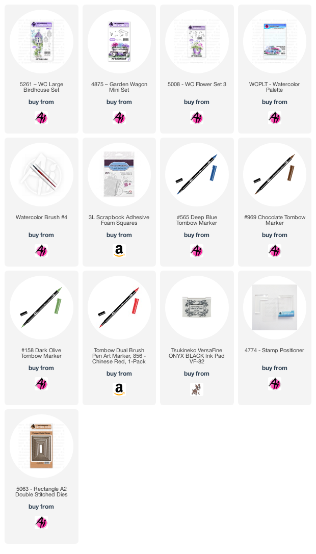
Using my #565 Deep Blue Tombow Dual Brush Marker, I coloured up one of the birdhouses from 5261 -WC Large Birdhouse Set, and then went over it with #969 Chocolate, before stamping it onto my Bristol Smooth cardstock.  I used a 3 1/4" circle die to create a mask using some printer paper, and taped it down, positioning it over the top of the birdhouse.  With my blender brushes, I used 4 colours of Distress Oxide inks to create the suggestion of a sky (Broken China and Faded Jeans) and a grassy hillside (Crushed Olive and Mowed Lawn).  I was careful to get fairly close to the birdhouse, but mainly avoided it with the inks. 
With the mask still in place, I used the two grasses from 4875 - Garden Wagon Mini Set inked in #076 Light Olive to stamp in the grass around the base of the birdhouse.  From 5008 - WC Flower Set 3, I chose one of the long stemmed flowers, and inked up the stems in #158 Dark Olive, and the blooms in #856 Chinese Red. *I didn't touch any of these with my damp brush, as their definition would've disappeared, but also the nature of the Distress Ink background is to turn a milky-white colour when it meets water, which I didn't want.
I did use my damp #4 paintbrush to soften the lines of the birdhouse, then I added in #969 Chocolate from my palette to paint streaks of brown on the post to create a woodgrain effect.  #856 was added to the roof, and #565 was painted on the house itself, and on the base.  I used a darker shade of #565 to add shadows under the eaves, in the holes, and down the post.  I used the two bird images from the 5261 - WC Large Birdhouse Set in #565/969 to stamp them on top of the inked background.  I painted in shades of #565 to give the birds colour, again being careful to keep my brush inside the images to avoid bleeding into the background.  Of course, being from Toronto, I had to make them into Blue Jays (you baseball fans will get that!).
The sentiment is from the Exclusive Daisy Set available through Scrapbook.com, stamped in Versafine Onyx Black ink.  The image was die cut with the 5063 A2 Rectangle Double Stitched Dies, mounted on some dark red cardstock, and adhered to the base with 3D foam tape.  Be sure to check out the Ai blog this Saturday to see what Dot & Tricia have to share, too.


Wednesday, July 8, 2020

Accessorize!

Hello Ai fans!
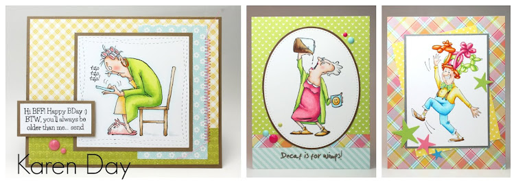
I'm sharing a card from one of the Ai Store Exclusive Sets: AICS05 Dare to be Fabulous!
Isn't she wonderful?  I decided that she needed some girly colours, and a little bling... so I used my Copic markers to colour her fur in shades of pink.  I made sure that she was colour coordinated, and accessorized to the max - which meant adding some tiny sparkles to her purse and earrings.
The fun sentiment is stamped in Versafine Onyx Black ink, die cut and matted with black, then adhered to my base with 3D foam adhesive dots.  I thought she deserved a bit of a fussy background, so I paired a couple of bold prints that nicely match her glam outfit.  My card is 5 1/2" square.
 Happy stamping!

Copics used: E11, E00, E000, R30, R89, R85, R83, R81, C7, C5, C3, C1, C00, B0000

Thursday, July 2, 2020

Retro Shop for Watercolor Weekend

It's time for Watercolour Weekend with Art Impressions!  I was aiming for a bit of a 'retro' feel with today's project - using a softer, muted palette for my scene:
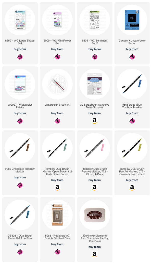
I stamped my Cafe image from 5260 - WC Large Shops Set in Tombow Dual Brush marker #969 Chocolate on my Canson XL watercolor paper.  I used my damp #4 paintbrush to soften the lines, and primarily pulled the colour out and away from the image, which gave a soft brownish halo to the shop - like a 'sepia-toned vintage photo' appearance.  I almost left it that way, but this is when I decided to use a very muted, pale colour palette.  I chose #076 Green Ochre (despite the name, it's a golden yellow shade) and painted a soft wash of it as the shop colour, and stamped it with the tiny dotted flower image from 5009 - WC Mini Flower Set to fill my flower boxes.  A stronger shade of it was used to paint in the door.
I chose #772 Blush to paint in the sign, and add the stripes to the awning.  A very watered-down version of #526 True blue was used for the window boxes and painted in as the sky.  The flowers needed to stand out a little more, so using the finer tip of my #312 Holly Green - I added the tiny little bits of foliage directly on my paper.  I painted it in as a suggestion of the grass, and some shrubbery, then used the marker to draw in a few blades of grass.  With #992 Sand, I painted in the walkway, and added a little colour to the roof.  I picked up a very watered down version of #565 Deep Blue from my palette, and used it to paint shadows on the chimney, under the eaves, stairs and planter boxes - and also painted shadows into the windows.  I made sure to leave plenty of white space on the windows to imitate the reflections in the glass.    
Lastly, I stamped the Cafe sign using #969, then used Memento Rich Cocoa ink to stamp in the sentiment from 5136 - WC Sentiment Set 2.  The scene was diecut with the 5063 - Rectangle Double Stitched Dies, mounted on a soft kraft cardstock and added to the background I'd chosen of some muted/retro papers.  I am always drawn to strong, bright colours - so this was very out of my comfort zone!  I recommend trying something new whenever you can (it's a great way to get yourself out of a rut, and off in a new direction!).  
Be sure to check out the Art Impressions blog this Saturday, to see what Dot & Tricia have to share.

LinkWithin

Related Posts with Thumbnails