Tis the season for 'Top' lists... I've already done an Art Impressions Top 5 list, and on Instagram you can see my Top 9 based on likes & comments. Here's my personal Top 10 - based on my own favourites from 2024. This was harder than usual! Being newly retired, I produced more cards this year, as well as had more time to spend on each project if I felt like it. That may be the best part of being retired, just taking the time to enjoy crafting at my own pace. So here they are, simply in chronological order:
May 5th - Art Impressions Birdhouse

May 17th - Geraniums from The Greetery

June 2nd - Art Impressions Gnomes

June 5th - Hoopla from The Greetery

June 23rd - Spellbinders Floral Spray

July 24th - Fresh Picked Anemones/Buttercups by Spellbinders

August 4th - Art Impressions Butterfly

August 11th - Spellbinders Betterpress Peacock

October 10th - Pigment Craft Co. Floral

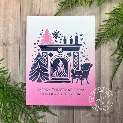
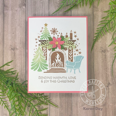
December 5th - Betterpress Cozy Fireplace from Spellbinders

It was definitely a Spellbinders year, as I acquired several new floral sets, and really jumped on the Betterpress bandwagon. Happy to have several of my Art Impressions paintings make my list, as I really spend time working on those projects to make them worthy of posting.
As always, thank you to everyone who takes the time to view, like and comment on all of my social media posts. I look forward to more crafting in 2025!