Sunday, September 7, 2025

Hello Fall Wreath & a Fall Scene

 I am on the Art Impressions blog today for their Watercolour Weekend post!


Painting fall scenes are among my favourite things to paint!  Another thing I love to do is to use multiple stamp sets to create my scene, which is what happened with my first card:


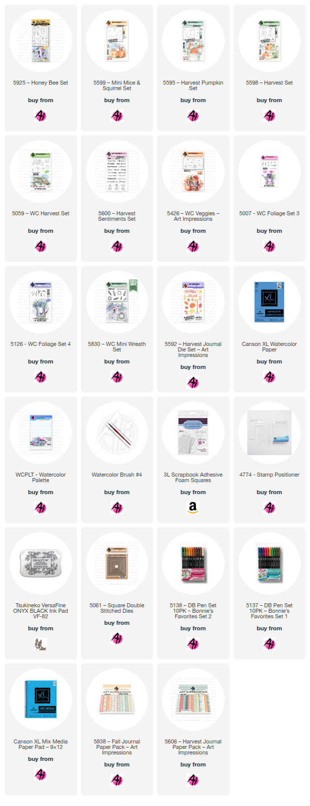
This was the first time I've used the Canson XL Mixed Media paper that is available in the shop, and it wasn't bad to paint on!  It's very lightweight, and fairly smooth, but took the colour well.  I started by stamping the large birdhouse from 5925 - Honey Bee Set in N45, leaving off the lower right corner as I knew that I was going to stamp the single pumpkin from 5595 - Harvest Pumpkin Set beside it.  After masking the birdhouse, I stamped the two pumpkins from 5059 - WC Harvest Set in N55, and put the mouse from 5599 - Mini Mice & Squirrel Set in front.  I really love the line of leaves from 5598 - Harvest Set, and stamped it in front of the pumpkin, as well as just small parts of it on either side of my scene.


With all the elements in place, I started painting in #993 and #312 on the house, and to get the colour of blue that I was looking for, I used Stormy Sky Distress ink for the roof and wooden base.  On the two lighter pumpkins, I used #312/N45/565, and for the orange one I used #993/933/947/899.  The mouse was painted with layers of #899, and my black Twintone marker filled in his eye and feet.  The leaves were done in a multi-coloured fashion, using #126/933/993/899.  The sky was added using a wash of #565, and a wash of #126 was painted in as the ground.  I used my #565 to add shadows under the house and objects, and darkened up different areas with my grey Twintone - or redrew lines that had disappeared.

The greeting from 5600 - Harvest Sentiments Set was stamped in Versafine Onyx Black, and the scene was matted with a blue decorative rectangle die, and mounted on paper from the 5606 - Harvest Journal PP.

My second project was started with the intention of it being a wreath, but as I got painting, I stopped at a half-wreath since I liked the way it looked.


I started with the veggies from 5426 - WC Veggies, stamping them in N55, masking where needed (can you tell that's some broccoli peeking out??).  Then I began building my design with the ferns from 5830 - WC Mini Wreath Set, done two-toned in 126/993 and 126/158.  The vines from 5007 - WC Foliage Set were coloured in #565/177, stamping one in each direction, on each side.  This is the point where I decided that I didn't want to do an entire wreath, so I added the leafy branch from 5126 - WC Foliage Set 4 in 933/993 on either side to finish it off.  I decided that my wreath needed a little something beside the veggies, so I used the small sprig from 5830 - WC Mini Wreath Set in a bit of a rainbow fashion using #565/685/933/993.  After painting in the veggies with (orange) 933/947/969 (brown) 899/947 (yellow) 993/899/933 and (green) 249/177/126, I touched everything with a damp brush, and pulled out a bit of the colour.


After looking for a sentiment to add, I found the Hello Fall die in the 5592 - Harvest Journal Die Set.  I first painted it in an ombre style on watercolour paper, but it looked a little bold.  Knowing that I intended to add a metallic gold mat under my square, I tried adding a gold diecut layered over the painted one, and loved the look!  A few dots with my gold pen added a little more sparkle.  The square was cut using the 5061 - Square Double Stitched Dies, and was mounted onto paper from the 5838 - Fall PP with 3D foam adhesive.


Friday, August 29, 2025

Sea Friends Shaker card

 A bonus fourth project using the June Betterpress Society plate, Sea Friends - is a shaker card.

I just had to make one of these!  So many options of how to do it.  I used one of my 'rejected' panels from the seahorse card, as this one was too bold and too busy for that project.  It worked really well for this, though.  I used the add-on plate, to press the bubble frame onto my background, then adhered the Waffle Flower shaker cover to it on three sides.  I poured in a mixture of iridescent discs and micro beads, along with a pressed and diecut starfish from this set.

After closing the shaker, I adhered it to my card base, and went about adding the pressed and diecut images around the outside.  All images were pressed with Pinkfresh Studio inks, using one or two shades on each.  I pressed the sentiment from the add-on set in Black Betterpress ink, and cut it with the coordinating die, adhering it to the center of my card.

You can get a Betterpress Society subscription from The Papercrafter's Workshop.


Monday, August 25, 2025

Sea Friends & Graphic 45

My third project with the June Betterpress Society plates, 'Sea Friends' was featuring some gorgeous patterned paper from the Graphic 45 line, 'Seas the Day'.

Since I had already pressed a bunch of the undersea images using Pinkfresh Studio inks on regular cardstock, all I had to do was pick my paper, then I diecut a Pinkfresh oval die, inked up the bottom half of it with aqua ink, and pressed one of the sentiments with Betterpress black ink.
I arranged a few of the pieces off to one side, and adhered it to the background with 3D foam adhesive.
You can get a Betterpress Society subscription from The Papercrafter's Workshop.


Thursday, August 21, 2025

Seahorse Card

My second card with the June Betterpress Society plates, 'Sea Friends' featured some repetition.

I pressed the seahorse from the set in five different inks from Pinkfresh Studio, and cut them out with their coordinating dies, along with one of the sentiments from the set.

To create my background, I smooshed five Distress inks onto my craft mat, misted it with water, then pressed my white cardstock into it to pick up the colour.  I stitched around the outside of my panel a couple of times in wonky fashion for a little extra decoration.

The sentiment was added with 3D foam adhesive, and a few blue iridescent jewels brough the sparkle.


You can get a Betterpress Society subscription from The Papercrafter's Workshop.


Monday, August 18, 2025

Sea Friends

The June Betterpress Society plates, are a set of underwater images, called "Sea Friends".  I decided to create a beachy background to showcase the shells in the set.

I used five Distress Oxide inks blended to create my shoreline, leaving a bit of a white area between sand & sea.  I went over that section, by pouncing some white paint with a blunt blending brush to make it look like seafoam.  Water was sprinkled to give some colour variations, and a little brown ink was spattered onto the sand.

I trimmed down the panel to be 4"x 5 1/4", and mounted it onto a white card base.  I pressed the two shells in several different inks, and cut them out with their coordinating dies, along with one of the sentiments from the set.

To go with the 'sparkle' part of the sentiment, I die cut each of the shell shapes, and the sentiment shape out of gold glitter cardstock, layering it behind the sentiment, and tucked in behind a couple of the shells.

It created a nice beachy card!  You can get a Betterpress Society subscription from The Papercrafter's Workshop.


Wednesday, August 13, 2025

CAS Watermelon cards

This was so fun.  Just some die cutting, a little glue and a sweet sentiment.

I've seen similar ideas online, and when the Simon Says Stamp Instagram challenge for August was circle cards, I knew this would be the perfect idea.  After picking my palette, I used various circle dies from my stash to cut out the different parts of the watermelon, added a few seeds and used the sentiment and die from Pigment Craft Co's Fruity Sentiment set.

For the A2 card, I used the same cardstock colours to cut different strips with the faux stitching, and glued them to my base at different angles.  *The seeds are actually the petals from a floral coverplate die, that were the perfect size and shape!


Monday, August 11, 2025

Poinsettia Spray

I am playing along with the August sketch on the Papercrafts Inner Circle Facebook group.  This is the Poinsettia Spray die set from Spellbinders.


I pulled out some ancient Close To My Heart papers from my stash... and cut out the pieces to create two cards.  Since the sketch had an oval shape, I knew this was the perfect set.  In addition to regular cardstock, I cut some of the pieces out of Spellbinders Brushed Gold Treasured cardstock (love this stuff!).

After assembling everything, I dug out the Foilables Christmas Sentiments from Pink & Main that I foiled in gold last year, that are all ready to be used in my craft room, and added them to the bottom of my cards with 3D foam adhesive.


LinkWithin

Related Posts with Thumbnails