Showing posts with label Tombow markers. Show all posts

Thursday, July 30, 2020

Another Retro Shops Card

Hello Ai Watercolour fans!
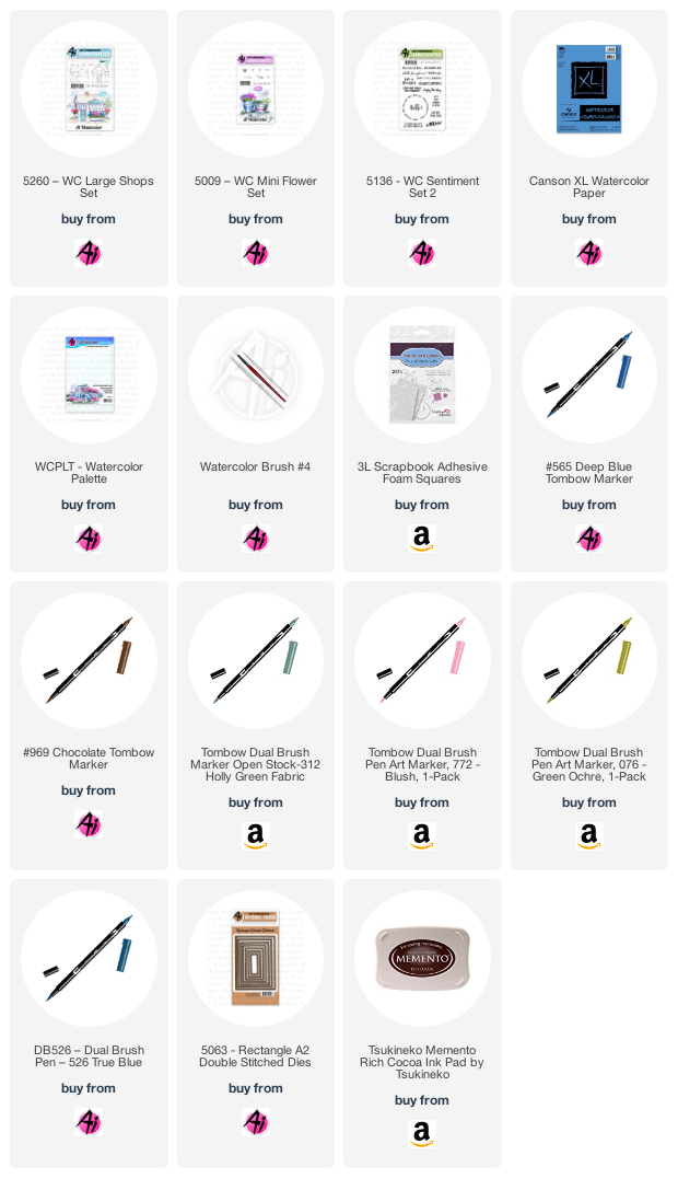
A few weeks ago, I posted a softer retro-feel look using 5260 - WC Large Shops Set, and I have another one to share with you today, using the other shop image.  *The Ai Design Team is participating in the Cards for Kindness initiative put on by Scrapbook.com - scroll down to see what I'm sending in!
 I inked up the shop with my Tombow Dual Brush Marker in #879 Brown, and softened the lines with my damp #4 paintbrush - I love the smudgy/hazy feeling it gives to my scene!  I pulled out the brown colour to add a light wash to the roof, and painted in the door handle hardware with my brown.  Since I was aiming for a soft & pretty effect, I chose #772 Blush - coloured on the tiny dotted flower image from 5009 - WC Mini Flower Set, which I stamped repeatedly in the window boxes.  After softening them with my paintbrush, I stamped them a second time to get some darker colour onto the flowers.  It was also painted on the door, and I added darker lines to suggest that it is painted wood.  I scribbled #991 Light Ochre onto my palette, and painted it in bold stripes on the awning, and a soft wash on the sign and door cover.  With #526 True Blue, I added pale colour to the shop, and a darker version of it to the window boxes.  Using #312 Holly Green, and the small leafy image from 5009, I stamped foliage on either side of the shop, and then painted it in to suggest the grass, keeping an unpainted area for the walkway and a circular patio.  I used the marker directly on the paper to add foliage to the window boxes.
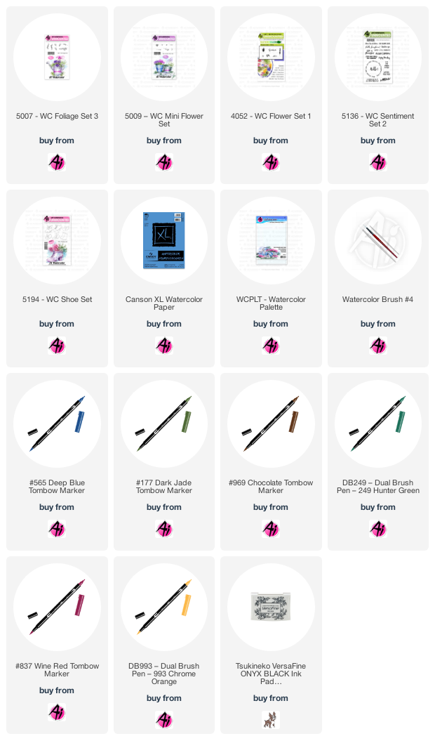
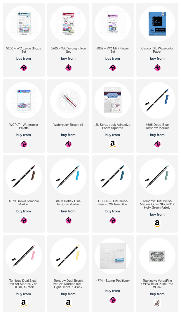
I coloured the table and two of the chairs from 5265 - WC Wrought Iron Set in #879, and used my Stamp Positioner to place them on my little patio.  A little of #493 Reflex Blue was painted in for the sky, and #565 Deep Blue was painted into the windows and as shadows where needed.  I die cut my scene with a stitched square die, matted it with chocolate cardstock and adhered it to my polkadot card base.  I stamped the sentiment from 5136 WC Sentiment Set 2 in Versafine Onyx Black ink, then cut it out with 5064 Circle Double Stitched Dies.  After matting it with chocolate cardstock, I adhered it to the base with 3D foam adhesive.
Here are the ten cards that I am sending to Cards for Kindness - these will be given out to nursing homes, hospital patients and front line workers all who might need a lift.  Check out the Scrapbook.com website to find out how you can participate.  Scroll down to see each card:


Thursday, July 2, 2020

Retro Shop for Watercolor Weekend

It's time for Watercolour Weekend with Art Impressions!  I was aiming for a bit of a 'retro' feel with today's project - using a softer, muted palette for my scene:
I stamped my Cafe image from 5260 - WC Large Shops Set in Tombow Dual Brush marker #969 Chocolate on my Canson XL watercolor paper.  I used my damp #4 paintbrush to soften the lines, and primarily pulled the colour out and away from the image, which gave a soft brownish halo to the shop - like a 'sepia-toned vintage photo' appearance.  I almost left it that way, but this is when I decided to use a very muted, pale colour palette.  I chose #076 Green Ochre (despite the name, it's a golden yellow shade) and painted a soft wash of it as the shop colour, and stamped it with the tiny dotted flower image from 5009 - WC Mini Flower Set to fill my flower boxes.  A stronger shade of it was used to paint in the door.
I chose #772 Blush to paint in the sign, and add the stripes to the awning.  A very watered-down version of #526 True blue was used for the window boxes and painted in as the sky.  The flowers needed to stand out a little more, so using the finer tip of my #312 Holly Green - I added the tiny little bits of foliage directly on my paper.  I painted it in as a suggestion of the grass, and some shrubbery, then used the marker to draw in a few blades of grass.  With #992 Sand, I painted in the walkway, and added a little colour to the roof.  I picked up a very watered down version of #565 Deep Blue from my palette, and used it to paint shadows on the chimney, under the eaves, stairs and planter boxes - and also painted shadows into the windows.  I made sure to leave plenty of white space on the windows to imitate the reflections in the glass.    
Lastly, I stamped the Cafe sign using #969, then used Memento Rich Cocoa ink to stamp in the sentiment from 5136 - WC Sentiment Set 2.  The scene was diecut with the 5063 - Rectangle Double Stitched Dies, mounted on a soft kraft cardstock and added to the background I'd chosen of some muted/retro papers.  I am always drawn to strong, bright colours - so this was very out of my comfort zone!  I recommend trying something new whenever you can (it's a great way to get yourself out of a rut, and off in a new direction!).  
Be sure to check out the Art Impressions blog this Saturday, to see what Dot & Tricia have to share.

Thursday, June 18, 2020

A Wreath for Watercolour Weekend

I haven't made a wreath in a while with my Art Impressions watercolour stamps, and after seeing inspiration on Pinterest, I decided to try something a little different from my usual style.
I began by lightly drawing a 3" circle in pencil on my Bristol Smooth Cardstock, and marked the points at which I wanted the sprigs to end.  Using my Tombow Dual Brush Marker in #312 Holly Green, and the two skinny sprigs from 5126 WC Foliage Set 4, I stamped them in several directions at each end of the wreath.  Using the largest sprig in the set, and #158 Dark Olive, I stamped the branch upwards from the lower right corner, several times, and again in the opposite direction along the lower side.  Next it was time to work on the cluster of flowers.
I used the triple rose cluster from 5258 WC Flower Set 4 and my #533 Peacock Blue marker to create the flowers, sometimes colouring only one or two of them.  I placed several more flowers sporadically around the wreath.  After dabbing them with my damp #4 paintbrush, the flowers needed to be darker, so I used my #565 Deep Blue picked up off my palette, to deepen their centers.  With the larger vines from 5126 WC Foliage Set 4, I stamped in greenery around my cluster using #373 Sea Blue - but the colour was too harsh, so I went over it with #249 Hunter Green, which was a better choice.  With the tiny Foxglove stamp from 4052 Flower Set 1 and my #606 Violet marker, I stamped it 3 or 4 times moving the stamp out slightly each time, to create trailing blooms coming out of my cluster.  After touching them with my damp brush, I added another few dots off the end of the flowers to make them appear to be a pointed shape.  Finally, to create the strings of flowers coming off the bottom of the wreath, I used the image from 5009 - WC Mini Flower Set that has 3 heart shaped flowers.  Colouring just one of them with #565 Deep Blue, I carefully moved it straight downwards and stamped numerous times without reinking (If I had moved the stamp away to reink, I would never have gotten it back to the same spot to continue).  I used my TT42 - Twintone Blue Marker - 42 Navy to draw in the stems, and to add dark centers to the roses.  Anywhere there were spaces needing to be filled, I stamped in a little greenery, or used my markers right on the image to draw in a leaf.
The sentiment is from 5266 - Greenery Invites, stamped in Versafine Onyx Black Ink.  I used my sewing machine to stitch the image to a black mat, and adhered it to my blue base with 3D Adhesive dots.  Be sure to check out the Ai blog on Saturday to see what Dot & Tricia have to share!


Thursday, June 4, 2020

A Little Southwestern Watercolour Weekend

I have a Southwestern scene to share this week for Art Impressions' Watercolour Weekend!  
For most of my cards (but especially this one!) I like to plan them out on scrap paper ahead of time.  I usually sit down in front of the TV and design a whole bunch of cards, planning the layout, the stamp sets and even colours/paper if I can.  I don't like to just sit down in front of a blank piece of watercolor paper and try to start stamping - I find I'm much more productive if I have a sketch and a plan.  Here's what my sketches look like:
With my sketch beside me, I planned out what the cactus cluster was going to look like on scrap paper, mixing and matching stamps, and trying out colours to get it just right.  I started stamping it on Bristol Smooth Watercolor paper from the bottom up, using the rock cluster from 4763 Southwest, colouring them in my Tombow Dual Brush Marker #N55 Cool Grey 7, then I added the smaller stones from 5196 WC Desert Set in #947 Burnt Sienna.  I masked the stones, and stamped the prickly cactus from 4763 Southwest in #228 Grey Green, masked it - and stamped the spiky greenery in #312 Holly Green.  With all of the masks in place, I added the larger cactus from 5196 WC Desert Set in #177 Dark Jade in the background.
I put my watercolor paper into my Misti, along with the frame from 5269 Wood Frames Set from the Bible Journaling line.  I coloured about 3/4 of the frame with #969 Chocolate - just enough to stamp the left side of the frame.  Then I repositioned my paper, moving it about 1/2" to the left and coloured the portion to the right of the cacti, and stamped it.  I did this to make the frame longer than it is, about 1/2" extra so that I could fit the scene in the background.  I used the smaller rock formation from the 5198 WC Mountain Set coloured in #947, stamping it in the upper left, and after masking the frame, a portion of it in the lower right.  I stamped the tiny rocks from 5196 Desert Set around the base of the mountains several times in #947.
Now that the stamping was done, I finally grabbed my #4 paintbrush, and pulled the colour out of all the images, concentrating it in areas where the shadows would be, and leaving plenty of white highlight areas.  I purposely kept the frame very streaky, adding warmer and darker browns to achieve a worn wood effect.  The river was painted in with #565 Deep Blue, picking it up off my palette, and then using it to add shadows in the mountain crevices and on the rocks & cacti.  I added touches of #676 Royal Purple all over my painting to liven it up a bit!  Finally the sky was added with #493 Reflex Blue, and I added touches of it to my scene as well.  I die cut my painting with a 5063 Rectangle A2 Double Stitched die, matted it with kraft cardstock and adhered it to my base with some thin 3D adhesive.  A few sequins finished it off. *I had intended to hand write a sentiment just below the frame - but chickened out at the thought of maybe messing it up after all my hard work!  I may think about it a little longer and add it in... 
Before I painted today's card, I actually did a "Pacific Northwest" version using a pine tree & mountains:
 I created my tree with the WC Tree Set 2, added a few rocks around the base, and a touch of grass.
 I used the twig frame in the Frames set, using the same method of stamping and moving my cardstock before stamping the right side.  I used the other mountains in the mountain set to stamp my scene in the frame, and painted the rest in with my brush.


Thursday, May 14, 2020

Exclusive Rose Set for Watercolor Weekend

 For the upcoming Watercolour Weekend on the Art Impressions blog, I have coloured up the pretty rose bouquet image from the Exclusive Rose Set available at Scrapbook.com:
I used one of the Double Stitched A2 Rectangle dies to cut my Canson XL Watercolor paper, and put it into my Misti along with the image that I chose.  This allowed me to colour it in stages, using multiple colours and restamping when needed.  I used my Tombow Dual Brush Marker #725 Rhodamine Red to colour the buds and the outer petals of the roses, then switched to #993 Chrome Orange for the rose centers.  I softened the lines with a damp #1 paintbrush, then scribbled them both onto my palette and painted in the pink and orange tones, concentrating them in the crevices between petals.  I did a similar process for the leaves, stamping them first in #177 Dark Jade, pulling out the colour with my damp brush - and then restamping after colouring the veins and stems with #249 Hunter Green.  I picked up #126 Light Olive from my palette, added touches of this brighter green to the leaves, and added some #992 Sand to the woody stems.  
To finish the painting, I picked up #565 Deep Blue, and painted it as my background, concentrating it more, closer to the image.  The sentiment is from the Exclusive Daisy Set, stamped in Onyx Black Versafine ink.  After matting the image with a 1/16" black mat, I attached it to my base with 3D adhesive, then added a sprinkling of tiny white pearls.

Thursday, April 30, 2020

Bouquet for Watercolour Weekend

Time for another Watercolour Weekend post.  I love the 5194 - WC Shoe Set for it's versatility!  Each of the shoes in the set can create a totally different kind of card, and today I've chosen the work boot:
I began by colouring the boot with my Tombow Dual Brush Marker #565 Deep Blue, and stamping it off on scrap paper.  Then I reinked it with #969 Chocolate, and stamped it onto my Canson XL Watercolor Paper.  I used my damp #4 paintbrush to soften the lines and pull out the colour, concentrating it where the shadows would be: the lower edge of the boot, under the creases, and in and under the laces.
I always build my bouquets from the bottom up, so using the two trailing sprigs from 5007 - WC Foliage Set 3, I coloured them with #249 Hunter Green, and stamped them trailing over each side of the boot.  Next I used three different blooms from Flower Set - 4052, stamping the daisy bunch in #837 Wine Red, always 3 times in a circular pattern to create a cluster (this is a filler flower, and appears lower in the bouquet, so I start with them).  Using the Lupine-like bloom, coloured in #993 Chrome Orange, I stamped it twice.  Finally, with the tall bloom, I stamped it in #565, filling in areas that needed some shape, being sure to vary the height and angle of them.  After touching everything with a damp brush, I could see which spots needed to be filled in with greenery.  I used the small green from 5009 - WC Mini Flower Set coloured in #177 Dark Jade, stamping it repeatedly in and around the blooms, filling out the shape of the bouquet.
With my image complete, I picked up #565 from my palette, and added a few shadows, in and under the flowers, and on the boot as well.  I also painted the suggestion of shadows along the ground, and after watering the blue even more, I painted a background around the bouquet.  I stamped the sentiment from 5136 - WC Sentiment Set 2 using Versafine Onyx Black ink, then used my sewing machine to stitch the rectangle to some indigo cardstock.  I decided to mount it to my base on an angle, and added a few deep pink enamel dots. 


Friday, April 3, 2020

Exclusive Cherry Set for Watercolor Weekend

I am using the lovely Art Impressions Exclusive Cherry Set available from Scrapbook.com today!
I began by stamping my image onto some smooth watercolour paper (the paint doesn't move around quite as much, but gave me a bit more control of where my colour went).  Using my Tombow Dual Brush Marker in #837 Wine Red, I painted the cherries in layers, starting with a fairly pale wash, leaving plenty of white areas to give them a shiny appearance.  After several layers of #837, I wanted the shadows to be darker still, so I went over the darkest areas with #899 Redwood - which is a dark brown colour.  I painted the branch and cherry stems with #992 Sand, then added touches of #991 Light Ochre for a little warmth.  
I kept in mind that the undersides of leaves are always paler, so I painted those areas with a wash of #126 Light Olive.  The rest of the leaves were painted with #177 Dark Jade, and I added several layers of the colour, keeping it concentrated along the veins.  I used a wash of #565 Deep Blue to paint in my sky (it's much stronger than it shows in the photo!), and then I used #565 to add shadows to the branch, leaves and cherries.  The sentiment is from the Daisy Exclusive Set, stamped in Onyx Black Versafine ink.  I die cut my scene, then matted in on green cardstock and adhered it onto my patterned paper background.


LinkWithin

Related Posts with Thumbnails