Saturday, May 31, 2025

More Pattern Play!

 I'm so happy with this new die set!  This is Pattern Play by Concord & 9th. 


The dies do all the heavy lifting... all I needed to do was pick my colour palette, which is mostly cardstock from Concord & 9th, and then got down to business die cutting all the bits and pieces.

I knew when I purchased this (from the Papercrafter's Workshop!) that it would make wonderful masculine cards, so with that in mind, I picked some strong colours to work with.

I made two of each colourway, so am very happy to have four more cards in my stash!


Saturday, May 24, 2025

Ink Blended Betterpress card

 I have a third project with the March Betterpress Society plate, Sweet Life Floral.

I love ink blending on my plates, so used Speckled Egg, Salty Ocean and Wilted Violet Distress Oxide ink before pressing onto a Porcelain Cotton Card panel.

I wanted a lot of contrast, so cut the coordinating die out of black cardstock and adhered it over my panel.

A few black jewels and a sentiment from the You Are Everything Sentiments plate set finished it off.

You can get a subscription to the Betterpress Society from The Papercrafter's Workshop.


Tuesday, May 20, 2025

Sweet Life Floral Postage card

My second card design using the March Betterpress Society plate, 'Sweet Life Floral' also uses the coordinating die.


I used five Pinkfresh Studio ink cubes to selectively ink up the plate (it's one background plate, featuring all of these elements).  Colours are Bubble Gum, Aquarmarine, Passion Fruit, Sweet Mustard and Grassy Knoll.  I was able to use all but the three pieces you see in the photo above.

After die cutting, I arranged the cluster and mounted it on a rectangle and the coordinating Nested Postage Labels & Tag die set from Spellbinders, cut in a lime green.  I adhered the postage shape and a few of the flowers with 3D foam adhesive, along with the sentiment from the You Are Everything plate set.
You can get a subscription to the Betterpress Society through the Papercrafter's Workshop.


Sunday, May 18, 2025

Pattern Play

I am very excited to have the Pattern Play dies from Concord & 9th in my hands.  I think these are going to be great for making masculine cards, but really for anyone.  I pulled out my stash of C9 cardstock to put together 3 cards after running the dies through my machine quite a few times!

These were so easy to put together, since Concord & 9th does such a great job of coming out with pretty colour palettes each year.  These are mostly from 2024, with a little of the new Plumberry from 2025.


So fun to just be able to mix and match colours and pieces.  Stay tuned, I'll be sharing more of these soon!  You can get C9 products from The Papercrafter's Workshop.


Monday, May 12, 2025

Sweet Life Floral

 March Betterpress Society was a full background plate and coordinating die called Sweet Life Floral.

I created a couple of cards after creating paper pieced striped backgrounds.  I was going for a bit of a retro feel, and did one in warm colours, one in cool colours.

This one was pressed with Hickory Smoke Distress Oxide ink, trimmed down just a little, then mounted on some brushed silver cardstock.  One of the sentiments that comes with the set was pressed in silver metallic ink, then cut apart and also mounted on the silver cardstock.

My warm toned card was pressed with Antique Linen - it barely showed up, so I almost pressed it a second time with a warmer brown, but the subtle look really grew on me, so I left it as is and added my sentiment pressed on cream cardstock.  A few jewels were added to each card for a little glimmer.

You can get a subscription to the Betterpress Society from The Papercrafter's Workshop.


Friday, May 9, 2025

New Espresso Martinis

 Along with the martini cards that I posted yesterday... I made four more Espresso Martini cards, two of each colour


The die sets are Olive Martinis and Christmas Cocktails for the bow.  


The sentiments are from the Cheers Sentiments Betterpress plate.


The pierced background is the Dotted Tile Debossing Cover Die from Altenew.  I really love how it gives some subtle background interest.

Thursday, May 8, 2025

You Had Me at Martini

Such a great sentiment!  My last batch of martini/drink cards were a huge hit, so I've created another bunch.

This time I wanted to do more of a traditional martini, with olives and traditional garnishes, and went for a more muted palette (kind of loving these softer colours lately!).  This is the Olive Martinis die set, the bow is from the Christmas Cocktails set, and the sentiment is from the Cheers Sentiments Betterpress set.


I used the Starshine Background piercing coverplate as the background, and played around with the colours a little to make two similar versions.


All products today are from Spellbinders.

Monday, May 5, 2025

Wine Tasters

I had stamped this image some time ago, and coloured it up with Copic markers a few weeks ago.  This is the Wine Tasters set from Art Impressions - one of their amazing Girlfriends sets.

I've actually done this stamp set with this paper pack before!  I knew how well it worked, and didn't need to reinvent the wheel, so decided to do it again.  I'm using the Art Angel Mini Deck from Cosmo Cricket.  I pulled out colours from the papers to colour up the gals, then fussy cut them and mounted them onto my background with 3D foam adhesive.

I used strips of the different patterned papers in different widths, and cut a square of a brick toned paper to go under the image.  The sentiment is from the Get Corked stamp set by My Favorite Things.  A few champagne pearls finished it off.


Sunday, May 4, 2025

Lillies in a Teacup and a Birdbath


I am up on the Art Impressions blog today for their Watercolour Weekend post!

I love the sweet new 6024 Tea Time Set, and wanted to fill the largest teacup with some flowers...


I stamped the cup in N57, leaving the top rim and the motif uncoloured.  I searched through my stash for some flowers to fill the top, and realized that the bouquet from the recently released 6029 Easter Lilies Set fit perfectly!  So I coloured up just the blooms and foliage in N57, and since it is a clear stamp, I was able to position them where I wanted in the cup.


To keep the lilies white, I just added some shading down the center of each petal using #533/565, and outlined the stamens with my orange Twintone pen.  For the leaves, I did layers of #126/177, and added a touch of green to the bottom of the unopened buds.  I mixed #249/565 to create my aqua shade that I painted onto the cup and saucer, created a grey/green shade for the table, and added #533 to the background.  Thinking of my Grandma's teacups... I used my gold gel pen to add a gold rim to the saucer, and coloured in the leaves... then also added touches of gold the stamens in the flower centers.


I die cut my image with a stitched oval die, and put a metallic gold mat under it.  A slightly larger oval was cut out of patterned paper from the 6033 - Inspirational Easter PP, and was attached to my card base with 1/16" foam adhesive - you can see just a hint of the blue card base below it.  The image is raised on a thicker foam adhesive so there is a lot of fun dimension on the card!  To echo the gold touches, the sentiment from the Tea Time Set was gold embossed at the bottom.


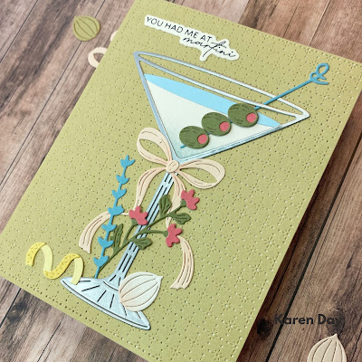
My second card features Kim's 5980 - Song Birds and Feeders set.  


I stamped the birdbath in #N57, then using my stamp positioner, added the branch and birds.   The mountains and hillsides were sketched in with a pencil.  I mixed shades of #565/177 to create the blue green colours of the mountains and hills, then added a wash of #177/126 to the foreground.  #565 was painted in as the water and shading contours on the birdbath. I brushed in #476 as the sky, being sure to leave some fluffy white areas to suggest clouds.


I made my birds into robins, as they're a sure sign of spring in my neck of the woods!  I added layers of #947 to their bellies, and shades of N45 to their head, back and feathers.  My black Twintone marker was used to dot their eyes.  There is a small bit of greenery included in the stamp set, so I used it along with #177 to stamp in the foliage, which I touched with a damp brush.  Since I wanted it to be a flowering spring tree, I used white paint to create blossoms in the tree, and dotted their centers with the fine point of my #933 marker.  I used the long grasses from 5126 - WC Foliage Set 4 in #565/177 to stamp some grass around the base of the birdbath, and added a few white paint flowers there as well.


After die cutting my scene with an oval die, I adhered it with 3D foam adhesive over a dark grey mat, and attached it all to my background made with two papers from the 5835 - Mini PP.  I finished off my card with some grey enamel dots.  The finished card size is 4 3/4" x 6".


LinkWithin

Related Posts with Thumbnails