Showing posts with label Ai Watercolor. Show all posts

Thursday, May 13, 2021

Try Something New

This week on the Art Impressions blog, our Watercolour Weekend theme is "Try Something New".  I've been wanting to combine stitching with my watercolour scenes for a long time, and this week's theme meant that it was time to give it a shot!  This took a little bit of planning:

I wanted the stitching to simply be an accent, not be all throughout the scene, so once I decided on a sunrise, I sketched it out on scrap paper, marking out the size of rectangular die I would use.  I picked my cottage, stamping it on the scrap to determine placement, where the stream would be, and even how the sun rays would look.  

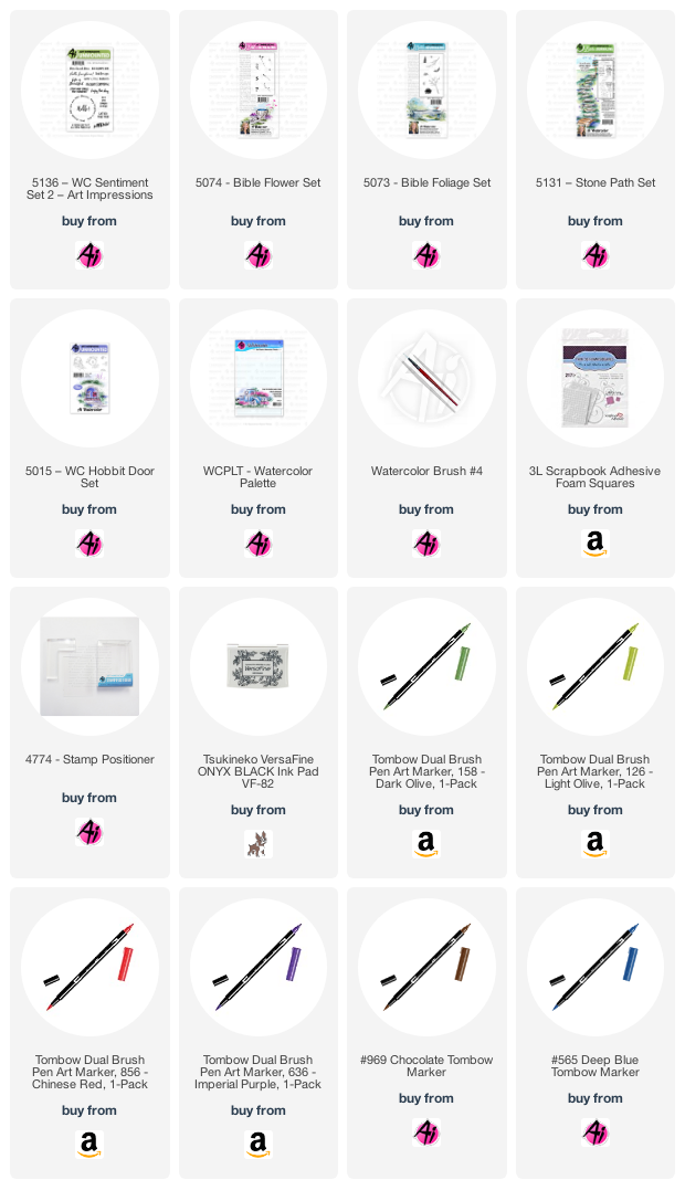
I diecut my 5063 A2 Rectangle Double Stitched Die from Canson XL Watercolor Paper, and stamped my cottage from 4961 - WC Mini Cottages Set, colouring it first in #969 Chocolate, with #565 Deep Blue overtop.  Next I sketched in my scene (you could definitely do this with one of the Ai scenes, but I used a pencil!).  I painted the sun and some of the sky with #993 Chrome Orange, adding several layers to darken the sun.  I added in #912 Pale Cherry and #451 Sky Blue to create my sunrise sky.  Since the light is coming from the back of my scene, I painted #993 along the top of the hillsides, around the edge of the house, and into the stream as a reflection.  It also meant that the front of the white cottage was in shadow, so I added shades of #565 to show that, and painted it into the stream also.  Using my stamp positioner, I stamped the tree from 5010 - WC Tree Set 1 beside the cottage, and did two smaller trees from 5372 - WC Mini Foliage to the left of the stream.

I did my foliage in layers, starting with the very light #126 Light Olive, using the foliage from 5372 - WC Mini Foliage, and the row of shrubs from the same set, below the trees - and dabbed them with a damp brush.  I stamped the foliage again in #158 Dark Olive, to add a few darker tones.  A wash of #158 was painted on all the grassy hillsides.  To balance the sun in the upper left, I stamped the spiky flowers from 5258 - WC Flower Set 4 in #993/#158, and added some foliage around the base of them.  Before darkening in the door and windows of the cottage, I went in directly with my markers to add some dots as flowers in window boxes.

For the stitching, I used a very fine hand sewing needle, as my thread was a very fine gold fillament.  I used my needle to pre-pierce all of the holes around the sun, and then did my long stitches to indicate the rays.  I went over the small flowers with stitches, and on the taller wildflowers I did some french knots - and I'm pleased to say that I only had one re-do!  My embroidery skills are a little rusty.

I mounted my scene on some matte gold cardstock, and adhered it to my base with 3D foam adhesive.


Thursday, August 13, 2020

Slimline Hobbit Door card

Hello Ai Watercolor fans! 
Slimline style cards have been all the rage recently, and I've been thinking how perfect all of the Art Impressions Bible Journaling stamp sets are for this long and skinny shape!
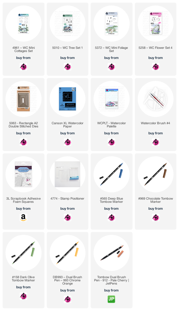
I started by diecutting my Bristol Smooth cardstock using this lacy, slimline die, and then began planning my card. The image from 5015 - WC Hobbit Door Set was coloured with my Tombow Dual Brush Marker #565 Deep Blue, with #969 Chocolate overtop, and then stamped about 1/3 of the way down my panel. Using my Stamp Positioner, I used the stepping stone image from 5131 - Stone Path Set, also coloured in #565/969, and stamped it to create a long winding path up to the door. The small mailbox from the Hobbit Door Set was given the same treatment. With a damp #4 paintbrush, I pulled out the grey/brown colour from the images, concentrating the colour in the shadowy areas of the stones and doorway. After scribbling #126 Light Olive onto my palette, I painted the light green as a wash of colour to suggest the grass and a hillside over the door. Using the small grass from 5073 - Bible Foliage Set, coloured with #158 Dark Olive, I stamped the grass repeatedly in and around the stones, around the door, and across the top to define the hill. Some extra greenery was added around the door, and I concentrated the darker green here to frame the doorway. #565 was used to paint in the door, layering it near the top where the shadows are, and also on the mailbox.
I repeated the blue shade by stamping the tiny dotted flowers in 5074 - Bible Flower Set along the path and beside the door. One of the longer stems from the Floral set was coloured with #158 as the foliage, and the blooms in #636 Imperial Purple - sporadically stamped along the stone path. #856 Chinese Red was added to the door hardware, and as the flag on the mailbox. The sky was painted in with #493 Reflex Blue. After softening everything with my damp brush, I added touches of #565 to add greater shadows to the stones. The sentiment is from 5136 - WC Sentiment Set 2. I adhered my panel to my blue base with 3D foam adhesive to finish it off.

Thursday, July 30, 2020

Another Retro Shops Card

Hello Ai Watercolour fans!
A few weeks ago, I posted a softer retro-feel look using 5260 - WC Large Shops Set, and I have another one to share with you today, using the other shop image.  *The Ai Design Team is participating in the Cards for Kindness initiative put on by Scrapbook.com - scroll down to see what I'm sending in!
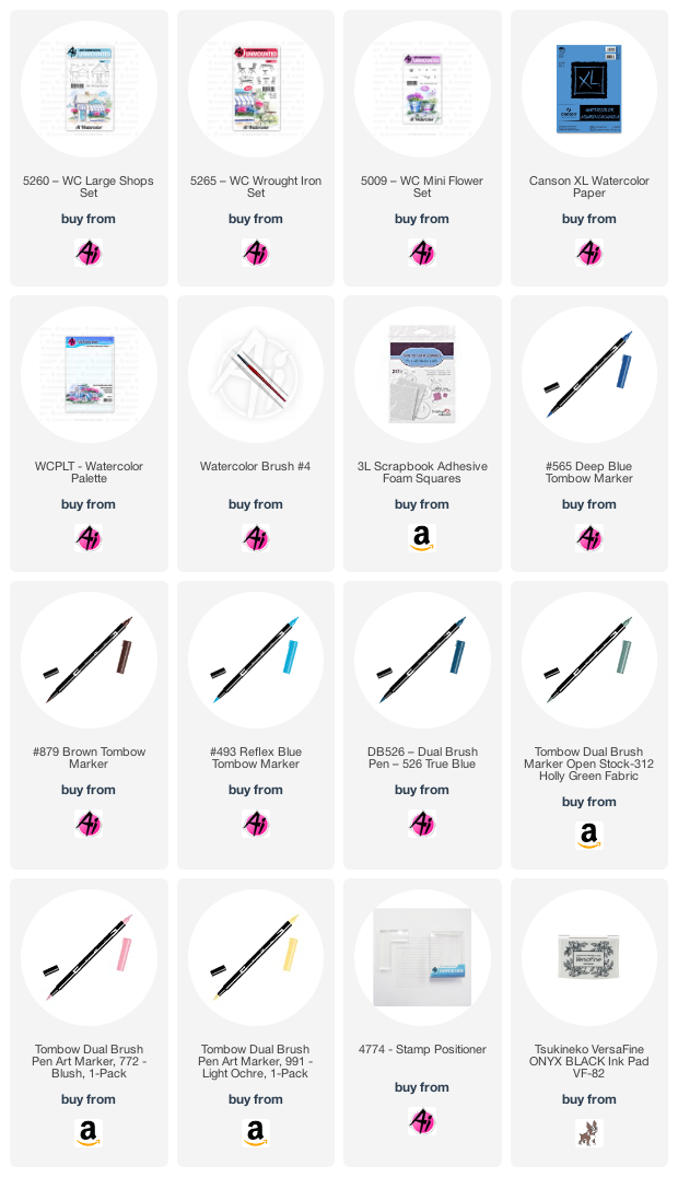
 I inked up the shop with my Tombow Dual Brush Marker in #879 Brown, and softened the lines with my damp #4 paintbrush - I love the smudgy/hazy feeling it gives to my scene!  I pulled out the brown colour to add a light wash to the roof, and painted in the door handle hardware with my brown.  Since I was aiming for a soft & pretty effect, I chose #772 Blush - coloured on the tiny dotted flower image from 5009 - WC Mini Flower Set, which I stamped repeatedly in the window boxes.  After softening them with my paintbrush, I stamped them a second time to get some darker colour onto the flowers.  It was also painted on the door, and I added darker lines to suggest that it is painted wood.  I scribbled #991 Light Ochre onto my palette, and painted it in bold stripes on the awning, and a soft wash on the sign and door cover.  With #526 True Blue, I added pale colour to the shop, and a darker version of it to the window boxes.  Using #312 Holly Green, and the small leafy image from 5009, I stamped foliage on either side of the shop, and then painted it in to suggest the grass, keeping an unpainted area for the walkway and a circular patio.  I used the marker directly on the paper to add foliage to the window boxes.
I coloured the table and two of the chairs from 5265 - WC Wrought Iron Set in #879, and used my Stamp Positioner to place them on my little patio.  A little of #493 Reflex Blue was painted in for the sky, and #565 Deep Blue was painted into the windows and as shadows where needed.  I die cut my scene with a stitched square die, matted it with chocolate cardstock and adhered it to my polkadot card base.  I stamped the sentiment from 5136 WC Sentiment Set 2 in Versafine Onyx Black ink, then cut it out with 5064 Circle Double Stitched Dies.  After matting it with chocolate cardstock, I adhered it to the base with 3D foam adhesive.
Here are the ten cards that I am sending to Cards for Kindness - these will be given out to nursing homes, hospital patients and front line workers all who might need a lift.  Check out the Scrapbook.com website to find out how you can participate.  Scroll down to see each card:


LinkWithin

Related Posts with Thumbnails