Wednesday, June 18, 2025

Stitching and Betterpress

I pressed both of these panels a few months ago, using the April Betterpress Society plates, 'Inkspired Wishes', along with a couple of older florals, and just got around to adding some finishing touches, and making them up into cards.


I used Betterpress black ink for the florals, then Solid Gold, Silver Shine, Lovestruck and Mojito metallic inks from Lisa Horton Crafts to press all the shapes from Inkspired Wishes.


This is the Sealed Floral plate, pressed onto a Porcelain Cotton card panel.  I used my sewing machine to stitch some lines of black thread onto the bottom right corner.


This is the floral plate that is included when you buy a Betterpress machine.  I used a ruler to pierce holes into my Porcelain Cotton Card Panel, then stitched my X's with two strands of black embroidery floss.  You can get a subscription to the Betterpress Society from The Papercrafter's Workshop.


Tuesday, June 17, 2025

Inkspired Wishes

The April Betterpress Society plate set is called 'Inkspired Wishes' - a great set of background accents and five sentiments.  I see them as great images to pair up with other products in my craftroom, this time as a background to some floral dies: 

I pressed the large splatter plate in Lisa Horton Crafts Solid Gold metallic ink onto some teal cardstock. 

Using one of my favourite die sets - Fresh Picked Anemones from Spellbinders, I cut out two of the flowers from the set, in the new cardstock colours for 2025 from Concord & 9th.

I kept it simple by just adding a sentiment from the You Are Everything Sentiments press plates, that was gold embossed.

You can get a Betterpress Society subscription from The Papercrafter's Workshop. 


Saturday, June 14, 2025

You're Sew Amazing!

It's my sister's birthday today!  I stenciled up this panel using the Rose Tapestry stencils from The Greetery with Distress Oxide inks many months ago, and have been collecting sewing themed products since then - so finally got it made up into a card.

I ran my panel through my die cut machine with the Starshine Background cover plate from Spellbinders, to give it a bit of texture, then added the Waffle Flower Quilted Frames Die cut from bright blue cardstock, to make it look like a quilt - and mounted it on a coordinating green cardstock.

It's my first time using the Needleworker Tool Kit dies from Spellbinders, so I cut out the spool, needle and scissors to coordinate.  

I pulled out the small alphabet dies from Art Impressions to spell out my inside greeting, as I didn't own it in stamp form.  Loving sewing themed cards lately, so you'll be seeing more from me this summer :-)


Thursday, June 12, 2025

Floral Martini

I think I warned you that there would be plenty of martini card posts!  I made two more cards this week using the Olive Martinis die set from Spellbinders.

I only took photos of one of them, but they were fairly similar.  I wanted to try a different look, using some busier background papers, so the floral paper is from the Hello Gorgeous pad, an older one by My Mind's Eye that I had in my stash.  It matched perfectly with a bunch of the die cut bits that I already had ready to go.

A few accessories are from the Christmas Cocktails add on die set, and the sentiment is the Betterpress Cheers Sentiments set (love these!).

Tuesday, June 10, 2025

Lakehouse Foundation

Art Impressions has recently released a bunch of products that are great for masculine cards, so to make my Dad a Father's Day card, I pulled out 6065 - Lakehouse Foundation.

I stamped it using Shadow Gray Archival ink from Ranger onto my Canson XL watercolour paper, then painted it using my Tombows.  I sewed the finished painting onto some warm brown cardstock with my sewing machine, then adhered it to my cardbase that was created with two patterns from the 6072 - Father's Day paperpack.

On the inside of my card, I used the 5927 - Father's Day Die Set cut from the same warm brown.


Monday, June 9, 2025

Wedding cards

I have two cards to share today that are remakes of cards of mine.  A friend picked them off of my Instagram feed, as she needed a couple of wedding cards.  I remade both of them with a few tweaks:

This is the Fresh Picked Buttercups die set from Spellbinders, remade exactly, just with the silver metallic sentiment from the Serenade Sentiments dies.

The slimline card had a few more changes, the stenciling was the same, but I added two of the white sprigs, changed the sentiment, and added a few blue iridescent jewels.


Sunday, June 8, 2025

More Long Line Leaves

I made another card using Kristina Werner's Long Line Leaves set while it was still out on my craft desk.

This time I went for a tone on tone effect, starting with a pale green cardstock base, and stamping with green Pinkfresh Studio ink.  I used the coordinating inks to stencil shades of green onto all the leaves, then cut out a frame using Spellbinder's Nested Postage Labels & Tag dies.  I stacked two other frame die cuts underneath it when I attached everything to my card base.

I used a Betterpress sentiment from the You Are Everything set from Spellbinders - Lisa Horton's Copper Pot ink pressed onto a Bisque Cotton Card panel, which I adhered over a copper glitter diecut.  A few irridescent pearls finished it off.


Friday, June 6, 2025

Long Line Leaves

I absolutely love the Long Line Leaves background stamp from Kristina Werner... and patiently waited two weeks to create with it after getting it into my hands!

I stamped in Versafine Onyx Black onto regular white cardstock, then pulled out my Pinkfresh Studio inks and tried a couple of different blending combos with the matching stencils - and love both of them!

This is going to be a well loved stamp... so many possibilities.  Looking forward to trying a watercolour version, some monochromatic ones, using coloured cardstock, etc.

I used the Dashing Sentiments stamps and dies from Pigment Craft Co., layered twice for some added depth.  A few black jewels and a black cardstock base finished them off.


Sunday, June 1, 2025

June Watercolour Weekend for Art Impressions

I am posting on the Art Impressions blog today for the Watercolour Weekend post!

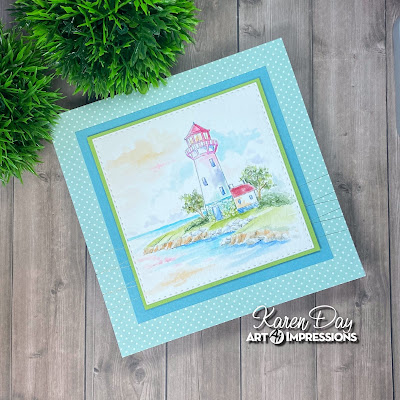
Every once in a while I love to just create a lighthouse card!  So I pulled out the 5466 - WC Lighthouse Set, and created a bit of a 'rainbow' lighthouse.

I stamped my lighthouse and one of the shorelines from the 5523 - WC Bait Shop set in the new Shadow Grey Archival ink from Ranger, since I knew I was going with 'pretty' colours, and didn't want any muddy outlines.  I stamped the two trees from 5372 - WC Mini Foliage in #969 on either side of the lighthouse, and using the foliage stamp from the set, I stamped in #177/126 to create the leaves.  To create my rainbow lighthouse, I started by painting the roof in #847, then used #685 on the railing, and as a wash on the main structure.  I moved into #606 and finally #407.  Into the stones at the base, I painted touches of #407 and then #126 near the bottom - so the colours fade from top to bottom in rainbow order.  A wash of #126 was added to the grass, and darkened in the crevices with #177.  I used the shrubbery row from the 5372 set to add bushes to either side of the lighthouse, then painted out those and the trees with a damp brush.  The roof of the small building was done with #847, and the base of it in #555.  Layers of #992/947 were painted on the edge of the bank, concentrating the colour in the crevices, and tones of #N55 were used on the rocks.

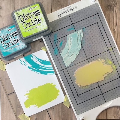
I loaded up my brush with #407 and painted a line to indicate the horizon, then washed out the colour in a streaky fashion along the shoreline.  I darkened the water nearer to the shore, using #555.  I wanted to create a bit of a fantasy sky, so painted some #407 in a way that suggested clouds (the white space left below), then added #991 to the sky, and a very pale version of #685.  Both of these colours were painted as reflections in the water as well.  I like to add some darker areas to clouds for just a touch of drama, so used a wash of #606 just above the horizon.  I used my grey Twintone marker to add in any details that were painted out, or simply areas that needed emphasis.  


My scene was cut out with the 5061 Square Double Stitched Dies, matted it on a pinkish/red square of cardstock, and attached a little off-center onto my patterned paper.  The finished card is 5 1/2" square.


Card #2 is featuring the 5748 - SF Cottage Creek Scenic Foundation from Summer 2023.  I had stamped this ages ago, and finally got it painted and made into a card.

I wanted to stick mainly with primary colours, so painted the house in #991, with the door and chimney in #847, and the roof in shades of #969 warmed with a touch of #947.  The same browns were used on the tree, and the stump from 5413 - WC Weathered Stumps that I added to the foreground using my stamp positioner.  #177/126 were painted as a wash on all the hillsides and grass, as well as with the foliage stamp from 5372 - WC Mini Foliage for the leaves, and the tiny grass stamp. The two pine trees from the set were used for the treeline in the background and the shrubs on either side of the door - in #177.  Using the gray Twintone marker, I drew in the stones on the walkway, and painted around them with #991.  The stones and rocks in the water were painted with touches of N55, 565 and 991.

Painting my way forward, I added #526 as the lighter blue in the water, keeping my strokes horizontal, and then I darkened the edges with #565.  565 and 847 were used to paint the birds, and N55 added some colour and shadows to the birdbath.  Masking the stump, I added the stem from 5009 - WC Mini Flower Set in 177/565 and the sprig from 5828 - WC Poinsettia Set in #407.  With the tiny sprig from 5009 set, I added green foliage to the base of the flowers, and around the house - and topped them with tiny white flowers painted with the Bleed Proof White paint.


LinkWithin

Related Posts with Thumbnails