A few weeks ago I posted another colour version of this card, and it's just so pretty, that I had to make a new one. My daughter needs a wedding card, and this may end up being what she uses. This is the Spellbinders Freshly Picked Buttercups die set, cut out of a warm green and pale blue, then a little ink blending was added to give some shading. I used a wonderful gold glitter cardstock to cut out the centers, and everything was glued onto some textured turquiose cardstock.
Thursday, April 11, 2024
Buttercups
Wednesday, April 10, 2024
Ombre Floral J
Another of my Betterpress experiments, today! I wanted to see if I could press an ombre effect, so I sponged three colours of Distress Oxide Inks (regular distress inks just bead up on the plates), onto my Floral J and Sentiment press plates. I used Peacock Feathers, Wild Honey and Abandoned Coral - all of which create other colours when overlapped. It worked really well!
I used regular cardstock, so there isn't much of an impression - but it really gave a nice crisp image, so I'm really happy with the result. I pulled out some Watercolour Wishes patterned paper from Lawn Fawn from my stash, and layered a few colours to match my inks. I added a few sparkly enamel dots, and added Stickles to the flower centers.
You can find all of your Betterpress supplies (and Distress inks!) at the Papercrafter's Workshop.
Monday, April 8, 2024
Floral Z
A Zillion Thanks! This is the Floral Z and Sentiment press plate from Spellbinders. This started out as an experiment with their Pebble Cotton Card Panel, to see how Distress Oxide inks would blend on it - and it worked out really well!
I used Shaded Lilac, Spun Sugar and Kitsch Flamingo Distress Oxide ink - just doing a soft blend in a blotchy pattern on my panel. Then I ran it through my Betterpress machine using their black ink. I then used regular distress ink smooshed on my palette as watercolours - and painted in the flowers, following the same gradient as my ink blending. You can see it a little better in my close up:
Finally, I die cut my panel and mounted it on black and periwinkle cardstock. I still may go back and add some sparkle to the flower centers... You can find all your Betterpress supplies at the Papercrafter's Workshop:
Sunday, April 7, 2024
April Watercolour Weekend
I am up on the Art Impressions blog today with two projects for the Watercolour Weekend post!
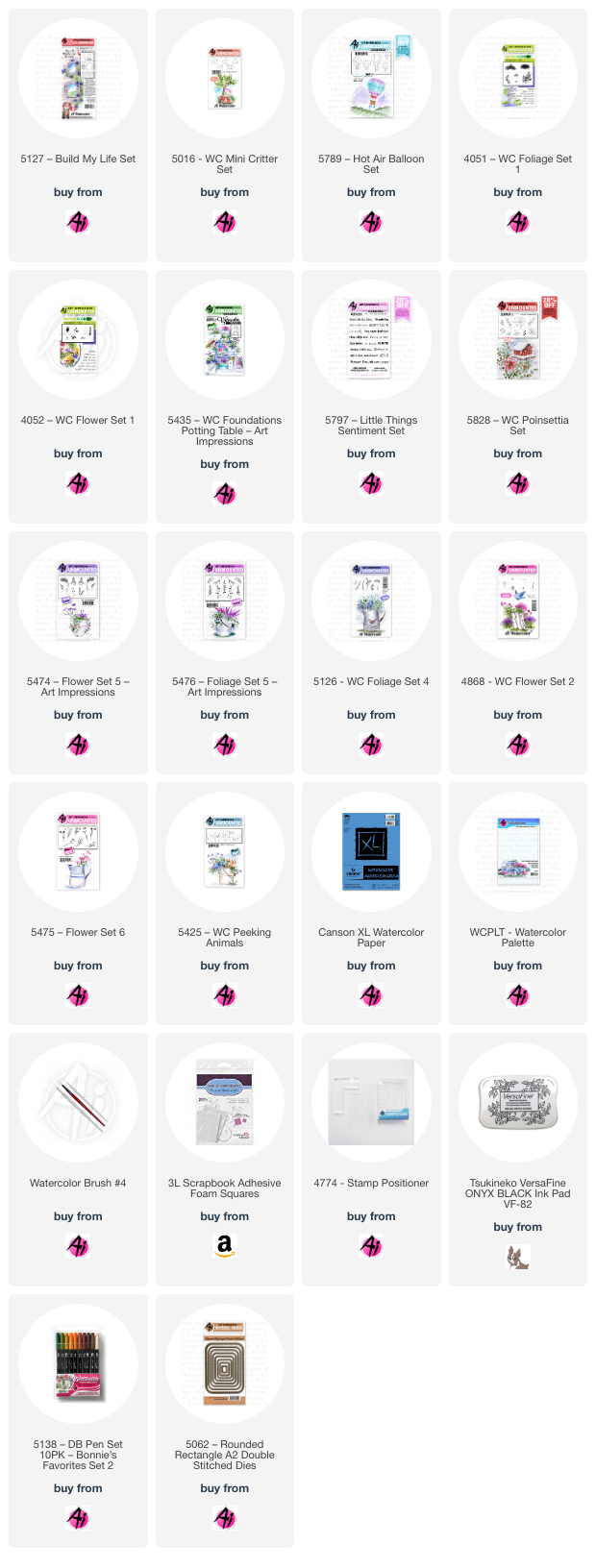
My first card features the wonderful 5435 - WC Foundations Potting Bench. What I love about the Foundations stamps, are that they take all the guesswork & planning away - you get a substantial scene planned out for you, no figuring out if something is the right size, or how many pots you can fit! You still get to customize it with whatever colours and flowers you want to use - but you can get right down to business, and start painting.
I picked out my colour palette first, choosing yellows(991/993)/blue-greens(312/407)/purple(565)/brown(969/947)/grey(N55/N57). I wanted a softer outline, so I stamped my image using N55 using my Misti - which is really helpful for such a large image, incase you miss a spot. I began painting my pots first to plan out my colours, giving them all a base coat. I decided to add my critter from 5425 - WC Peeking Animals to one of the pots, so I used my stamp positioner to place him perfectly.
I used 7 different stamp sets to create my pots!! I won't go over each flower, but did want to mention how I did the pansies in the box on the middle shelf. I used the daisy bunch from Flower Set - 4052, colouring the top of each flower in 993, and the bottom in 565 - I'm quite happy with how they turned out! The other stamp sets I used are 5126 - WC Foliage Set 4; 5475 - WC Flower Set 6; 4868 - WC Flower Set 2; 5476 - WC Foliage Set 5; 5474 - WC Flower Set 5; 5828 - WC Poinsettia Set. I stitched my scene to a brown mat with my sewing machine, and used some 3D foam adhesive to adhere it to my base.This month, I wanted to give some love to one of the Ai Bible Journaling sets - so I pulled out 5127 - Build My Life Set, and created a little scene.
I stamped the window, pots and puppy (5016 - WC Mini Critter Set) after colouring them with 969/565 (masking the pots as needed). With masks in place, I also masked the window, and then inked up the brick texture stamp that comes in the set, with N57 - not colouring it completely, being a bit sporadic, as I wanted an aged look to the stones. I used the leafy branch from 5126 - WC Foliage Set 4 in 249, and stamped it repeatedly to create my vine. For a little different leafy detail, I used both vines from the set, and stamped them in 249/126. I purposefully left a few open areas, so that I could stamp the daisy bunch from 4052 - Flower Set in 993 to add flowers to the vine.
After using a damp brush on the foliage, I continued with my brush to pull out the colour from the lines of the bricks and the window - then filled the bricks in with N57 and 977 to add some warmth to the bricks. 977 was also used on the pots, and N57 on the puppy. I used both grasses from 4051 - Foliage set, in 249/126 around the pots, and pulled out the colour to ground the scene. To create a little view out of the window, I used 5789 - Hot Air Balloon Set, to stamp two hot air balloons in the sky, and painted in the hills (249/126) and sky (493). I used 933/493/993 to paint in the balloons. I went around the scene with 565 - adding it as shadows on the window and bricks, and on the undersides of the pots. The sentiment is from 5797 - Little Things Sentiment Set, and the image was die cut with 5062 - Rounded A2 Rectangle Double Stitched Dies.
Thursday, April 4, 2024
Oh Sing Window
I like to colour while I'm watching TV or Youtube videos, so I recently found these two Windows to the World images, stamped and half coloured in my stash. So I pulled them out, and finished colouring them up. These are M4878 - Oh Sing Window, stamped in Memento Tuxedo Black ink, and coloured with Copic markers:
I used several pieces of Art Impressions patterned paper for both my backgrounds, and a couple of stitched flag pieces for decoration. I'm having a good time using older products this week!
Tuesday, April 2, 2024
Floral Q
Quintessentially yours! What a great sentiment. This is the Floral Q and Sentiment press plate from Spellbinders. I'm loving working my way through a bunch of different letters that are part of this collection.
Monday, April 1, 2024
Beautiful Blooms
There's something about making a set of cards that just makes my brain happy! I recently acquired the Beautiful Blooms stamp/stencil/die set from Pinkfresh Studio, which creates six pretty floral images. After doing a test run using them in some soft ink colours, I started creating a card with each one.
The Congrats card may be my favourite in the set! I used Spellbinders Essential Arches dies for the green and blue panels, which are popped up with 3D foam adhesive over a white base cut with the PF Diagonal Stitched Plaid coverplate. The floral is also on 3D adhesive, tucked inside the window. The two negative arches were used for the second card, adhered with 3D adhesive over a peach cardstock panel cut with an Altenew coverplate die.
All of the cards were splattered with gold paint, and had gold pearls added for decoration. The sentiments are all PF's Perfect Sentiments that were gold embossed, and all attached with 3D adhesive.
%20(1).jpg)
.jpg)
%20(1).jpg)
.jpg)

.jpg)
%20(1).jpg)

.jpg)
.jpg)
.jpg)
.jpg)

.jpg)
.jpg)

%20(1).jpg)
.jpg)
.jpg)

.jpg)
.jpg)
.jpg)