Hello Ai Watercolour fans!
I have started all of my posts of the past (almost) 13 years with that phrase. It is a bittersweet day for me that this will be my last post as part of the Art Impressions design team. I started on the main team in 2013 after falling in love with Bonnie's amazing Girlfriends, and Old People stamps - still my favourites to this day! I took a short break 4 1/2 years later, then returned on the Watercolour team where I've remained until today. Life changes, and it's time for me to allow someone else to be part of this amazing team, using Bonnie's wonderful creations. Thanks for being along for the ride with me!
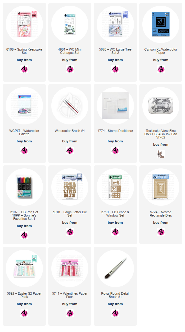
My first card is using the newly released 6106 - Spring Keepsake set.
I positioned the frog and watering can on the same block, and stamped them both using Tombow #N45 onto my Canson XL Watercolour paper. After masking, I stamped the pot behind them, and then added the flower bouquet.
I was painting this in the middle of a snowstorm! So I was reaching for bright, spring colours (helped brighten my mood, but the snow kept coming!). I wanted a lot of contrast on the frog, so used #126/055/245/373, using the same on the greenery, but with some darker #177 added in. #515 was painted in layers on the pot, and N45 watered down on the watering can. #991/933 were used for the daffodils, and shades of #847 for the tulips. A wash of #565 was painted as the sky, and used to add shadows around the images, and amongst the flowers. When I'm painting something metallic or shiny, I like to add hints of the other colours in my painting, so you'll see touches of pink, blue and green on the watering can - as though it's catching their reflection.
The Spring die is from the 5719 - FB Fence & Window Set, cut twice and glued together to be a little sturdier. The scene and blue mat are die cut using the 5724 - Nested Rectangle dies. I mounted my scene onto some bold paper from the 5741 - Valentines paper pack.
My second card was a bit of a departure for me... and the jury's still out on this one! I was inspired by a card from Alli Frazier, whose card was very CAS using diecuts. I thought a watercolour version would be fun to try:
I really love the Ai alphabet dies... so I pulled out the 5910 - Large Letter Die set, then went searching for a house that was the right scale, facing forward. But first, I had to make a template to plan out my card. I traced a 4 1/4 x 5 1/2" rectangle on my Canson XL Watercolour paper, and drew a line across it diagonally in pencil. I placed the letter dies along the line, and this allowed me to figure out my placement for the house from 4961 - WC Mini Cottages Set, which I inked in Tombow #N45, and stamped. I picked the three trees from 5826 -WC Large Tree Set 2, and after masking the bottom portion along my line and the house, I inked them all in #312 and stamped them across the page at varying heights, stamping some a second time without reinking.
There was still a lot of sky on my card, so I decided to add the larger mountains from 5198 - WC Mountain Set, inked in #533. I pulled out the colour of both the mountains and trees with a damp brush. The house was painted with #N45 on the roof, #703 on the house, and #847 on the chimney. I used #565 as a wash in the sky, and to add shadows to the house & windows. I used my Gray Twintone marker to darken the lines of the house and to outline the smoke.
This is the point where a lot of debate ensued! The mountains and trees were way darker than I'd envisioned - I had wanted them to be more of a hazy background. I used some of the white paint to soften the lines/colour of the mountains, and painted in the smoke from the chimney. I added a strip of green cardstock under the line - and had planned to use the same green for the letters, but they were too similar of a colour to the trees. The pink letters were much bolder than I intended, but gave a better contrast with the background. My daughter described this as a girly card!! Which I'm okay with. So the pink won.
I found this pale green striped paper in the 5892 - Easter S2 paper pack, and cut it to contrast with the angle on the card. I thought the word 'home' was a little lonely on it's own, so pulled the sentiments out of my craft stash to finish the card off. The sparkles are just clear silver, and look great in person, but appear black in the photos. It was a lot of fun doing something out of my normal style.
On a parting note - a huge thank you to Bonnie, Phil, Joel, Kim & Kendra for everything. It's been such a joy to work with you & your amazing products.