


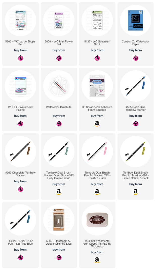
I chose #772 Blush to paint in the sign, and add the stripes to the awning. A very watered-down version of #526 True blue was used for the window boxes and painted in as the sky. The flowers needed to stand out a little more, so using the finer tip of my #312 Holly Green - I added the tiny little bits of foliage directly on my paper. I painted it in as a suggestion of the grass, and some shrubbery, then used the marker to draw in a few blades of grass. With #992 Sand, I painted in the walkway, and added a little colour to the roof. I picked up a very watered down version of #565 Deep Blue from my palette, and used it to paint shadows on the chimney, under the eaves, stairs and planter boxes - and also painted shadows into the windows. I made sure to leave plenty of white space on the windows to imitate the reflections in the glass.

Lastly, I stamped the Cafe sign using #969, then used Memento Rich Cocoa ink to stamp in the sentiment from 5136 - WC Sentiment Set 2. The scene was diecut with the 5063 - Rectangle Double Stitched Dies, mounted on a soft kraft cardstock and added to the background I'd chosen of some muted/retro papers. I am always drawn to strong, bright colours - so this was very out of my comfort zone! I recommend trying something new whenever you can (it's a great way to get yourself out of a rut, and off in a new direction!). 

Be sure to check out the Art Impressions blog this Saturday, to see what Dot & Tricia have to share.

OH MY!!! This is absolutely stunning and makes me want to skip making dinner and get out this set right now! Thank you so much for the tips, I can't wait to try this out :)
ReplyDeleteFabulous color choices!!!
ReplyDelete